Posts

Showing posts from 2012

Best ad of 2012

Image
This year has seen a variation of memorable ads; Vinnie Jones’ British Heart Foundation, Inferno’s Listen to the Kids, Skittles Midas touch, Guardian’s Three Little Pigs, and the ever-irritating Go Compare and Wowcher ads. However, I felt I needed to write a post on my favourite one of 2012. Not just an ad but the whole campaign by AMV BBDO that has been running since 2010; Snickers – You’re Not You When You’re Hungry. The ads are still shown today and I think they have remained the best of the year. The message that you’re not yourself when you’re hungry is massively relatable on a global scale. I know for a fact that I turn into a diva/zombie/monster when I’m starving, and it’s something that everyone has experienced. This is why I believe it works so well. Message aside, the idea of using celebrities who have played notoriously evil characters, or those who have exaggerated their negative stereotype, is genius. The most popular one in the UK is the football locker room ad c

The evils of advertising

Image
(Other cool stuff from the place I found this:  http://chicquero.com/  )

Grammatically correct graffiti

Image
How many times have you sat on a pub toilet and read all the scrawlings on the back of the door? And how much does it amuse you to, not only see a spelling mistake, but to see someone has come along and corrected it. I am a bit of a spelling and grammar nazi myself, and I can't help but correct people when they say 'should of' instead of 'should have', or when they pronounce schedule like 'SKEDule' (we Brits say SHEDule). Anyway, I was walking to work today in Richmond and I passed the newly constructed Pret. It's still all boarded up and on the front I spotted this: This blatant error sparked a two-person correction! The person with the pencil violently circled it and wrote 'Plural!!', and the person with the pen was clearly not impressed and gave it a shameful -1 out of 10 and slapped Pret with an F-. Poor Pret wouldn't even get into sixth form with those grades. You'd think, with the sign being so large, that the mistake would

Clean up your profiles! Future employers are watching you...

Image
Imagine if the deciding factor of you getting that dream job or not, was based on whether you’d chosen the hilarious kebab on the toilet photo, or the classy dinner party photo, to be your Facebook profile picture? We all use Facebook to stalk our friends/friends of friends/people we hate.. …but what we often forget, is that our future employers can stalk us too. I have just come across this fascinating infographic by Career Builder called ‘ What do employers find when they search for you online ?’ which has stats on how many, and which type of, employers use social media to scope out candidates as potential employees. A growing 37% of employers in the US use social media to search for you, with Facebook being the number one stalking method, closely followed by LinkedIn and Twitter. The reason most of them pry is, not because they are trying to catch you out, but because they want to see if you present yourself professionally and if you’d fit in at their

Hooks get a New Look

Image
A quick blog post in my lunchbreak. When shopping on Saturday, I found these little beauties in the changing room of New Look. I love them! And it did actually make my life easier not having to remember which sizes I'd kept and which ones I'd discarded. You may wonder where is the 'Definitely Not' hook? Well, how very sneaky of them - there isn't one! 

My Top 5 high-quality content eCommerce sites

Image
‘Patience is a virtue’ .  A lovely saying, isn’t it? Although, I presume the person who invented that adage never had to sit at a computer and trawl the web for information he couldn’t find, all the while blocking pop-ups and being directed to places he never wanted to go. There is never a more infuriating time to encounter these issues than when attempting to purchase something online, and some eCommerce sites don’t make it any easier. When a customer is parting with their money on your site, the last thing you want to do is stress them out, confuse them, or make yourself look unreliable; because inevitably, that person won’t return. The EasyJet website is a prime example of a bad eCommerce website. They are my regular airline because they are marginally cheaper, but trust me; you pay for it in other ways – perhaps high blood pressure or alopecia. When I recently booked some flights, I wanted to have all 4 of us on the same flight, but 1 of us needed to get a different fligh

Disney's top hottest males

Image
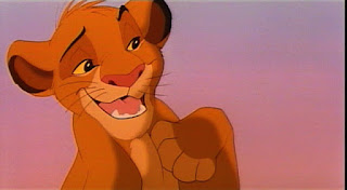
If you are new to my blog, I feel I must clarify that this is my first post of this... variety. I usually talk about ads or marketing or amazing things I've done, but a recent conversation about how hot Simba from the Lion King was, sparked a lot of thinking on my part about attractive animated characters. So much so, that I felt compelled to share my conclusions with you. So, in no particular order and subject to change, here goes... 1. Simba - Lion King Quoting my friend from the aforementioned conversation, 'I think it's his hair; it's all messy and sexy.' So, could it be the tousled hair that makes Simba so irresistible? Is it his playful smile? Or perhaps his goal-orientated nature and eagerness to be king? Whatever it is, he is one hot cub. *NB. Simba's hotness is strictly confined to his childhood years. When he walks over that log and sings himself into adulthood he loses all appeal.  2. Prince Eric - The Little Mermaid D

An ad that made me laugh out loud

Image
KFC - "Monkey Bites" Joke so bad that's it's good

Making things happen with Google Chrome

Image
Do you remember Google Chromes' ' Dear Sophie' ad from a year or so ago? An emotional journey of a dad who writes emails to his daughter every day since her birth, documenting every little thing, so she can read it back when she is older. I'm not going to lie, I'm jealous of Sophie. I only have a few photos and worn out anecdotes to prove that I even was a child. Personal feelings aside, it was a lovely ad, and I was very pleased to see that Google Chrome have kept up these moving stories. The most recent one I have seen now is Julie Deane. Take a look - Not only is this a well-shot and thought out ad which tells her story seamlessly, but it is a brilliant 'How To...' for people looking to get their name/product/business out there. With the recession, people are becoming a lot more entrepreneurial, and deciding to make something of themselves on their own. This ad is really relevant to today, which makes the public pay attention to it. Mainly I like

Brad Pitt perfume faux-pas

Image
I'm going to say something here and I hope you don't scold me for it; I don't like Chanel No.5. I think it is too harsh and smells like a musty old woman. 'Oh but it's Chanel , it's a classic !' That may be so, but it's not to my taste, just like crocs, baked beans, and Gary Barlow. I feel I had to write something when I saw this new ad for Chanel No.5. Take a look and you'll know why: Firstly, what the hell? Brad, what are you talking about? It reminds me of when I visited an art gallery years ago; the exhibition was filled with abstract pieces, there was even a canvas with a simple blue square that had aspiring art critics gasping with awe. I saw a few people gathered round a model of a fire extinguisher, searching desperately for the meaning and to connect emotionally with this piece. Turns out it was an actual fire extinguisher, created only for putting out potential fires in the gallery. This ad is like that fire extinguisher; i

Why Twitter is wicked, and why PR needs SEO

Image
"Dinner with the girls" is something I have been participating in since my friends started renting and buying. Long gone are the sporadic drunken weekday meetings filled with risqué conversation. Now it's a long process involving diary checking, rescheduling, and conversations where we talk about babies, mortgages, complain about jobs, complain about the government, complain about money... all part and parcel of entering our late 20's. Once, at one of these dinners, I was talking to my friend about Twitter because does the marketing for a huge, world famous brand. She shrugged, ‘I don’t see the point in Twitter’. Now, this is not the first time I have had to defend Twitter. Twitter has got a bad rep because of trolls, 'beliebers', mouthy footballers, and other idiots who actually say the word 'hashtag' without knowing what it means. I can understand why some people don’t use it and don’t ‘get it’. I was explaining the benefits of it and

Tique Booty

Image
About a year ago I wrote a post on Tique Booty, my friend's vintage clothing stall, located in Kingston Antiques Market. I decided to rewrite the post because the business has impressively grown since then, accumulating a wider range of more classic, diverse pieces and has earned a devoted following. Over the past year, Tique Booty has moved twice. First, to Kingly Court on Carnaby Street, where they set up shop in a pop-up shop called 'One Month Only' - they stayed on there far more than one month due to their success. Now, Tique Booty resides on Market Row, Brixton - a far more urban area, which, some would say, is better for their target market. Tique Booty Launch Party Sept 2012 Tique Booty are passionate about clothing and this shows in their stock; British and American fashion, all from different eras, different cultures and a huge range of styles, not just limited to clothing; but also art work and home furnishings. They are open to pretty much anything, b

Getting Rosie Arnold to see my work (and how to get someone to see yours)

Image
This is a post I have been meaning to write since May, because in May I wrote a letter to BBH's Deputy Exec. Creative Director and D&AD president, Rosie Arnold. I saw a presentation she gave about how there are not enough women in the creative industry, and I found her so inspirational that I was driven to contact her. I did my research and found that we both studied at Central Saint Martins, which was a great starting point, and that a couple of the accounts she works on at BBH are Persil and Axe, two brands that I'd already created my own ads for (see 15ish posts down). A funny obsession of Rosie's is that she collects old, squashed soda cans that she finds; a habit that she has no explanation for, only that she may 'find a use for them some day'. I found this hilarious as I have a similar habit; taking photos of license plates that spell short words. I also have no reason for this obsession, apart from the belief that I will use them one day for something a

Editing website video for FQC Solutions Ltd

Image
Look at these blog posts now coming in thick and fast! This week I bought the domain www.lauracripps.co.uk and it is sitting there, waiting. What should I put on it? My work history has been...well, colourful... and I have done a bit of everything. But not enough of one thing to make a website out of. I'm guessing my website should be like this blog, only with different pages for my drawings/designs, thoughts and ideas, projects I'm involved in, and videos I've edited. Speaking of which; I was recently asked to edit a video for a website. The company is FQC Solutions Ltd (Food Quality Compliance), and I was given footage of a presentation given by the Managing Director, David Brown, on 'Quality and Food Safety Management'. The video is designed to go on their website and give potential clients an idea of what kind of advice they can offer to other companies. It's a simple video, but there is a clear and inspirational message; that FQC Solutions care about

Facebook Funnies

Image
My last few posts have been pretty text-heavy, so i thought I'd provide some light relief with some photos that are on some of my favourite Facebook groups. I don't really like to join Facebook groups, I find that you're always bombarded with notifications and your newsfeed looks a mess (I like mine to look neat and aesthetically pleasing). Badly Stuffed Animals: Dog shaming: (this is actually a tumblr/website, but just had to share) Embarrassing Nightclub Photo of the Week: I'm a Creative:

Logo Drawing

Image
Once I got my job in digital marketing, I never thought I'd get the chance to put the old pencil to paper. No sketching, scribbling or designing the old school way. Luckily for me, a company that does the PR for our company wanted a new logo. The owner wanted a hand-drawn design of a jaguar to go with their company's name on the website and business cards. I was more than happy to oblige and I came up with this: I handed it in and they gave it to a graphic designer who touched it up and put it with the logo. The final result has just been shown to me today! I see it has been made quite dramatically different what with the shading and that, but I am still very pleased with the outcome, pleased I got to doodle for the day, and pleased I haven't forgotten how to draw! If you want to check out this brilliant PR company (shameless plug!) go here:  http://www.jaguarpublicrelations.com/

The power of social media - The Coyne's got Craig David to attend their wedding

Image
For my 11th birthday in 1996, I planned to have a Spice Girl's themed party. I was totally and utterly obsessed with them and thought it would be amazing to have them there. I wrote them a very polite letter, asking them to attend, and posted it off to the fan mail address that was at the bottom of their monthly newsletters. I may have been naive, but I whole heartedly believed that they would have read my letter and exploded through my door, doing back flips and flicking peace signs. Now, fast forward 16 years (cripes), and a whole lot has changed thanks to the internet. Kids have the opportunity to be in direct contact with their favourite celebrities, follow their every movement and perhaps even have them write back. This makes me feel sorry for my poor, expectant 10-year-old self. Case in point; my friend's brother and fiance really love Craig David and wanted him to come to their wedding. In pure 21st century social media fashion,  they put a video on YouTube of themse